本文初步探讨一下基于CSS的动画,主要对Transition和Animate两种方式的各种属性及其含义,通过示例进行对比。
概述
CSS Transition
CSS3 过渡是元素从一种样式逐渐改变为另一种的效果。
| 属性 | 描述 |
|---|---|
| transition | 简写属性,用于在一个属性中设置四个过渡属性。 |
| transition-property | 规定应用过渡的 CSS 属性的名称。 |
| transition-duration | 定义过渡效果花费的时间,默认是0。 |
| transition-timing-function | 规定过渡效果的时间曲线,默认是ease。 |
| transition-delay | 规定过渡效果何时开始,默认是0。 |
transition取值
|
|
例如
transition-timing-funciton取值
|
|
| 值 | 描述 |
|---|---|
| linear | 规定以相同速度开始至结束的过渡效果(等于cubic-bezier(0,0,1,1))。 |
| ease | 默认值,规定慢速开始,然后变快,然后慢速结束的过渡效果(cubic-bezier(0.25,0.1,0.25,1))。 |
| ease-in | 规定以慢速开始的过渡效果(等于cubic-bezier(0.42,0,1,1))。 |
| ease-out | 规定以慢速结束的过渡效果(等于cubic-bezier(0,0,0.58,1))。 |
| ease-in-out | 规定以慢速开始和结束的过渡效果(等于cubic-bezier(0.42,0,0.58,1))。 |
| cubic-bezier(n,n,n,n) | 在cubic-bezier函数中定义自己的值,n的值是0至1之间的数值。 |
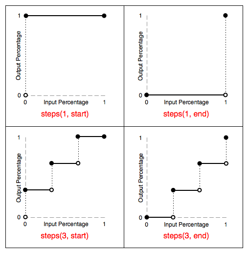
| step-start | steps(1,start) |
| step-end | steps(1,end) |
| steps() | 阶跃函数 |
cubic-bezier三次贝塞尔曲线
贝赛尔曲线是由法国数学家Pierre Bézier所发明,由此为计算机矢量图形学奠定了基础。它的主要意义在于无论是直线或曲线都能在数学上予以描述。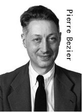
一个标准的3次贝塞尔曲线需要4个点:起始点、终止点(也称锚点)以及两个相互分离的中间点。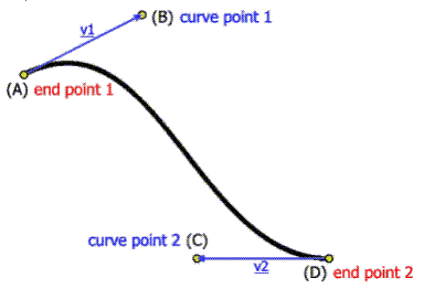
cubic-bezier的起始点和终止点固定为(0,0)和(1,1),cubic-bezier(x1, y1, x2, y2)
steps阶跃函数
阶跃函数是一种特殊的连续时间函数,属于奇异函数。
多属性支持
如需向多个样式添加过渡效果,请添加多个属性,由逗号隔开
各属性使用范例
transition-duration范例
transition-delay范例
transition-timing-function范例
总结
transition动画比较简单,animation动画功能更强,可以实现更加复杂的动画效果。
CSS Animation
| 属性 | 描述 |
|---|---|
| animation | 简写属性,用于在一个属性中设置四个过渡属性。 |
| animation-name | 指定要绑定到选择器的关键帧的名称 |
| animation-duration | 规定完成动画所花费的时间,以秒或毫秒计,默认是0。 |
| animation-timing-function | 规定过渡效果的时间曲线,默认是ease。 |
| animation-delay | 规定过渡效果何时开始,默认是0。 |
| animation-iteration-count | 规定动画应该播放的次数,默认值1。 |
| animation-direction | 指定是否应该轮流反向播放动画,默认值normal |
| animation-fill-mode | 规定当动画不播放时(当动画完成时,或当动画有一个延迟未开始播放时),要应用到元素的样式。 |
| animation-play-state | 指定动画是否正在运行或已暂停。 |
语法:
@keyframes
通过 @keyframes 规则,您能够创建动画。
创建动画的原理是,将一套 CSS 样式逐渐变化为另一套样式。
在动画过程中,您能够多次改变这套 CSS 样式。
以百分比来规定改变发生的时间,或者通过关键词 “from” 和 “to”,等价于 0% 和 100%。
0% 是动画的开始时间,100% 动画的结束时间。
为了获得最佳的浏览器支持,您应该始终定义 0% 和 100% 选择器。
注释:请使用动画属性来控制动画的外观,同时将动画与选择器绑定。
语法
|
|
属性值
| 值 | 描述 |
|---|---|
| animationname | 必需。定义动画的名称。 |
| keyframes-selector | 必需。动画时长的百分比。 合法的值:0-100% from(与 0% 相同) to(与 100% 相同) |
| css-styles | 必需。一个或多个合法的 CSS 样式属性。 |
animation-name
语法
|
|
属性值
| 值 | 描述 |
|---|---|
| keyframename | 规定需要绑定到选择器的 keyframe 的名称。 |
| none | 规定无动画效果(可用于覆盖来自级联的动画)。 |
animation-name 属性为 @keyframes 动画规定名称,例如demo
animation-duration
该属性和上面讲过的transition-duration类似。
animation-timing-function
该属性和上面讲过的transition-timing-function类似。
animation-delay
该属性和上面讲过的transition-delay类似。
animation-iteration-count
语法
|
|
属性值
| 值 | 描述 |
|---|---|
| n | 定义动画播放次数的数值。 |
| infinite | 规定动画应该无限次播放。 |
animation-direction
语法
|
|
属性值
| 值 | 描述 |
|---|---|
| normal | 默认值,动画按正常播放。 |
| reverse | 动画反向播放。 |
| alternate | 动画在奇数次(1、3、5…)正向播放,在偶数次(2、4、6…)反向播放。 |
| alternate-reverse | 动画在奇数次(1、3、5…)反向播放,在偶数次(2、4、6…)正向播放。 |
animation-fill-mode
动画结束以后,会立即从结束状态跳回到起始状态。如果想让动画保持在结束状态,需要使用animation-fill-mode属性。
语法
|
|
属性值
| 值 | 描述 |
|---|---|
| none | 默认值。动画在动画执行之前和之后不会应用任何样式到目标元素。 |
| forwards | 在动画结束后(由 animation-iteration-count 决定),动画将应用该属性值。 |
| backwards | 动画将应用在 animation-delay 定义期间启动动画的第一次迭代的关键帧中定义的属性值。这些都是 from 关键帧中的值(当 animation-direction 为 “normal” 或 “alternate” 时)或 to 关键帧中的值(当 animation-direction 为 “reverse” 或 “alternate-reverse” 时)。 |
| both | 动画遵循 forwards 和 backwards 的规则。也就是说,动画会在两个方向上扩展动画属性。 |
animation-play-state
animation-play-state用来指定动画是否正在运行或已暂停,一般有两种使用场景:
- 通过修改该值
paused/running可以控制动画的播放和停止 - 默认情况下当动画播放工程中,如果中断,这时会跳回到动画开始状态,可以通过设置该值,让动画保持在中断时的状态
语法
|
|
属性值
| 值 | 描述 |
|---|---|
| paused | 指定暂停动画 |
| running | 指定正在运行的动画 |
第三方动画库
animate.css
animate.css是来自dropbox的工程师Daniel Eden开发的一款CSS3的动画效果小类库。包含了60多款不同类型的CSS3动画,包括:晃动,闪动,各种淡出淡出效果,如果你想快速的整合各种CSS3动画特效的话,使用它即可方便的实现。
animate.css is a bunch of cool, fun, and cross-browser animations for you to use in your projects. Great for emphasis, home pages, sliders, and general just-add-water-awesomeness.
magic.css
Effect.css
针对不同UI的CSS3动画和过渡效果集,包含了丰富的CSS3动画和过渡效果
hover.css
A collection of CSS3 powered hover effects to be applied to links, buttons, logos, SVG, featured images and so on. Easily apply to your own elements, modify or just use for inspiration. Available in CSS, Sass, and LESS.